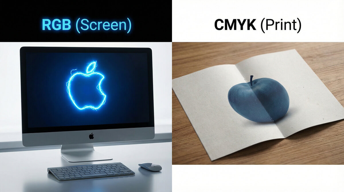
Have you ever experienced that disappointment? Your logo glows with a beautiful neon blue on the monitor, but when the box of printed pens arrives, the color is dark and lifeless. Where did it go wrong? The printer didn't make a mistake. You simply hit the physical boundary between light (RGB) and ink (CMYK).

The Basic Difference: Light vs. Pigment
To understand why colors differ, we must realize how they are created. While a monitor emits colors (shines light into your eyes), paper or a T-shirt only reflects light.
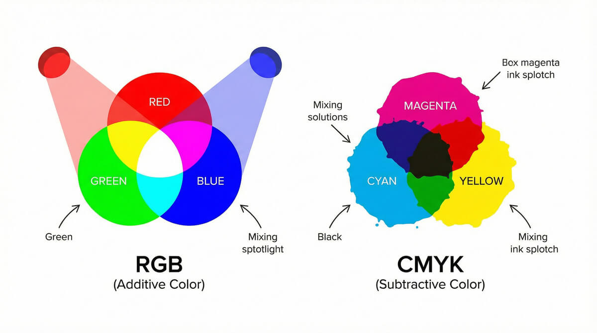
RGB (Red, Green, Blue) = Monitor
RGB is the color model used by all digital devices (phones, monitors, cameras).
- Colors are created by adding light (additive mixing).
- When you mix Red, Green, and Blue, you get white.
- Advantage: Can display millions of colors, including vibrant neons.
- Usage: Web, social media, emails, digital photography.
CMYK (Cyan, Magenta, Yellow, Key/Black) = Printer
CMYK is the model used for physical printing on paper and promotional products.
- Colors are created by layering ink on paper (subtractive mixing).
- When you mix Cyan, Magenta, and Yellow, you theoretically get black.
- Disadvantage: Has a smaller color range (gamut). Some vibrant screen colors simply cannot be "mixed."
- Usage: Flyers, business cards, T-shirt printing, billboards.
| Feature | RGB (Digital) | CMYK (Print) |
|---|---|---|
| Principle | Emitting light | Reflecting light from ink |
| Composition | Red, Green, Blue | Cyan, Magenta, Yellow, Black |
| Color Range | Large (vibrant colors) | Limited (duller colors) |
| Ideal Data | JPG, PNG for web | PDF, AI in vectors |
The Problem: What Happens When You Send RGB to Print?
If you send RGB data to the printer (e.g., a photo downloaded from Facebook), the printing machine must automatically convert it to CMYK. However, since CMYK cannot produce such vibrant colors, it replaces them with the closest possible match.
The result? Vibrant royal blue turns grayish. Neon green turns into forest green. This is called "color shift."

💡 Pro tip: The Solution is Pantone (PMS)
Do you need exactly "your" corporate blue on the pens? Do not rely on CMYK. For corporate identity, we use the Pantone (PMS) swatch book. These are direct colors that are not mixed in the machine but are pre-mixed in a can (like wall paint). This ensures the color is always 100% consistent.
Frequently Asked Questions (FAQ) about Colors
How to prepare data so the colors match?
Ideally, work in the CMYK color space from the beginning (e.g., in Adobe Illustrator). If you have data in RGB, expect the print to be slightly darker. You get the most certainty by supplying a so-called print PDF.
Why is black on the monitor different from the flyer?
In printing, there is "plain black" (100% K) and "rich black" (a combination of C, M, Y, and K). On an RGB monitor, both look equally black, but in print, plain black is more like dark gray. Our graphic designers at TAEDA watch out for this.
Can TAEDA print RGB colors?
No printer in the world can print pure RGB because paper does not emit light. However, we can approximate some shades using special technologies or by using Pantone colors.
Not sure about your logo colors?
Don't want to risk your corporate items having the wrong shade? Send us the data.
- ✅ Color check: We will alert you if the colors in the data are unsuitable for printing.
- ✅ Conversion to CMYK: We will professionally convert your RGB data for the best possible result.
- ✅ Pantone recommendation: We will help you find the closest Pantone color to your logo.
